Picture Perfect: What Makes a Good Image Great
There are good images and there are great images.
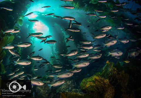
When I was a new underwater photographer, I entered a contest online that had the theme, "Schooling Fish." I had a few images of schools of fish, so I entered two that I thought were pretty good, and since the contest limit was three images, I threw in the only other image I had of schooling fish, which I didn't think was very good. As it turns out, I won first place with that image.
Since it was an online contest, it was open to comments from the public, and someone wrote underneath the image, "No offense to the photographer, but I don't see what's so great about this image." Frankly, that person voiced my feelings exactly. Luckily for me, another person posted a comment that explained exactly why the image was so great. He said, "This image leads your eye from left to right and swirls around the school ending up where you started only to compel you to look again."
Composition and the Viewer's Eye
I learned a valuable lesson from this experience, and that was that I needed to learn what the elements of a good image are so that I could use them to my advantage in the future. All too often I didn't understand why some images were better than others, and I thought that every photo I saw, that had something in it I had never seen before, was "great!" So my first lesson in learning to make a good image was to look for elements that would lead the eye through the image. Since western civilization reads from left to right, a good image will reflect that familiar direction. We interpret this as "good composition."
There are a few composition guidelines that can help you achieve this. The most familiar of these might be the "rule of thirds." This is when you divide your image into thirds both horizontally and vertically and the important elements of the image, such as the eye of a fish, are placed on the intersecting lines (about a third up or down, and about a third from the left or right of the image.) The "S" curve is another device (anything that leads the eye in the shape of an "S"), The Fibonacci sequence has a fascinating array of spirals, patterns, and the "golden mean" which are shapes occurring in nature that "feel" good when our eyes see them. For some people, the ability to discern these shapes is quite natural and we consider those people "gifted" or "talented" when they apply those abilities in art. Post processing software such as Adobe Lightroom and Photoshop has these patterns associated with the crop tool so you can see what they look like.
Lighting
Good lighting is crucial to good image making. There are lots of mistakes in underwater lighting that have become so common on social forums that our eyes are becoming accustomed to them. A common mistake is lighting the outsides of a subject, with a shadow in the middle. This occurs when the strobes are turned too far out, or are blocked by the camera's housing and cast a shadow through the middle of the image, like this:

There are a lot of other lighting problems with this image too. The strobe on the left is turned up too high, causing the light to be harsh. The water is dark and ugly, and could have been corrected with a higher ISO or larger aperture. The lighting in the image below is much better.
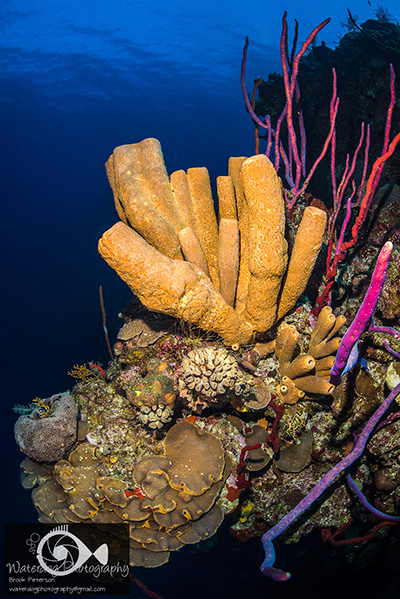
An image that is properly lit will have even lighting throughout the subject, without any highlights that appear white, and without any fall off of light through the middle. The viewer's eye should not be able to immediately tell whether a strobe was used, or whether the image is naturally lit. When we are under water, everything we see has a blue cast, so we have to use strobes to bring the color back. Our challenge as underwater photographers is to make images that don't have a blue cast, but that also don't have an obvious use of strobe. The image below shows a large sponge that is properly lit from top to bottom, with a beautiful blue background. The viewer must look closely to see that the ground around the sponge has a blue cast.
Provoking Thought
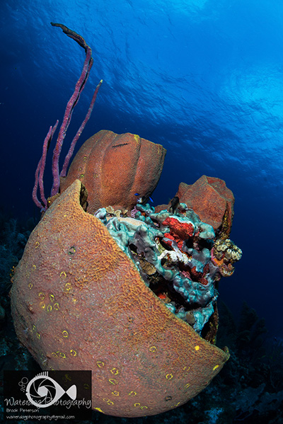
One last thought on making good images great. The image below would have been a good photo of the USS Kittiwake without the diver, but it becomes a much better image with the diver standing next to the wreck. This causes the viewer to react to the size of the ship relative to the man, and provokes a sense of awe and maybe even gives a sense of the mysterious. Perhaps it causes the viewer to imagine the ship is haunted by the ghost of the man standing next to it. In any case, that tiny added element provokes thought, and that makes the image GREAT.

With thousands of images flooding our social feeds, these few techniques are often overlooked when producing artistic and meaningful images. If you can remember that you want to create an image that causes the viewer to pause and allow his eyes to wander about the image, you have created a GREAT image. If you create an underwater image that lets the viewer forget that you had to use an artificial light source, then you have created a GREAT image.
This column originally published on Brook's blog, Waterdog Photography.
RECOMMENDED ARTICLES
SUPPORT THE UNDERWATER PHOTOGRAPHY GUIDE:
The Best Service & Prices on u/w Photo Gear
 Visit Bluewater Photo & Video for all your underwater photography and video gear. Click, or call the team at (310) 633-5052 for expert advice!
The Best Pricing, Service & Expert Advice to Book your Dive Trips
 Bluewater Travel is your full-service scuba travel agency. Let our expert advisers plan and book your next dive vacation. Run by divers, for divers.


